Just because...


We all take logos and design for granted and, quite frankly, I think we should. What I mean is that a logo should be like a referee in a hockey game, you know their doing their best when you don't even notice they're around.
By clicking the link under the picture above you'll be able to see the evolution of some 40 different corporate logos. I find SONY one of the most interesting merely because of their decided lack of major change over the past century. Almost all of the change in the SONY logo revolves around either slight squashing or elongation of the standard font. The great thing is that you know there's probably months of debate going into every proportional change to that font. The intense considerations that often go into the most miniscule tweaks to a logo makes them one of the ultimate forms of craft.
Know your audience and represent your entire brand in a scalable symbol that can be reproduced from one inch wide to a billboard.
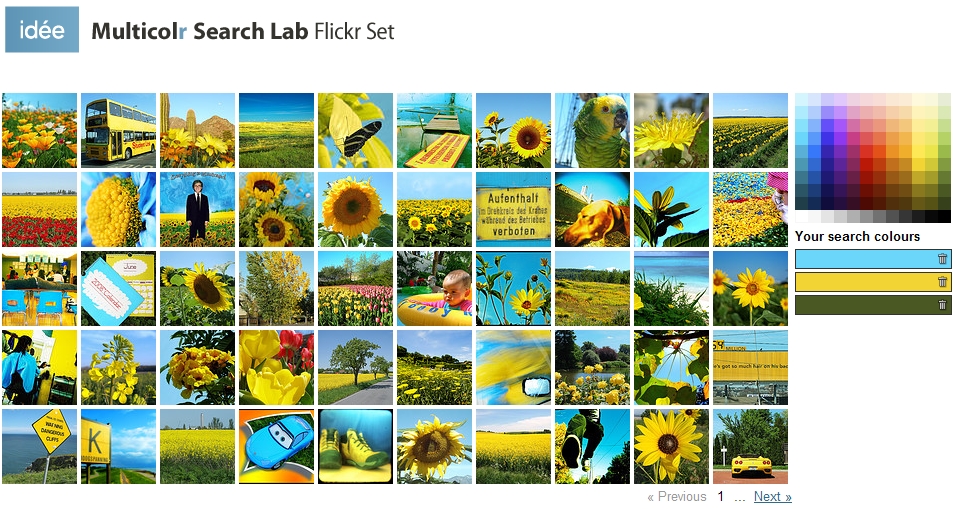
I'm sure some of you may have seen or used this site before, but Multicolr Search Lab (not a misspelling) is such a simple and cool use of the Flickr API, that I had to share it.
By clicking on a color swatch you see 50 matching Flickr pics. Great for building your own photomosaic. Even cooler is the fact that it modifies the link string so that you can bookmark your color combinations and come back to them later. With nine gradient shades of each color, the combinations a numerous.
Hope you dig messing around with this as much as I do.
Here's 40% Cyan, 60% Yellow and 80% Green: