thinglets: Couche Tard and Sloche Junkies

Perhaps one of the greatest names ever for a convenience store has evolved in translation.

Mac's (which started as Mac's Milk) has been a long-stnading brand in Ontario, Canada. While originally epitomized by a cat with a tartan cap, for the past generation the chain, having been purchased by a Quebec conglomorate and had their store name shortened to just Mac's, now boasts a winking owl as the corporate mascot.

Perhaps the best part of the acquisition was the rebranding of the store name in Quebec from Mac's to Couche Tard. Couche Tard literally translates to "up late", but in the context of the owl logo (appropriated from a previous acquisition called Winky's) makes the more common interpretation of Couche Tard as Night Owl.

Above and beyond the history, Couche Tard is just a really great name to yell at people when you want to sound insulting, but really be innocuous. Pronounced "Koosh Tar", we English-speaking folk often harden up that final "D" in translation, but such is the fault of our weak command of a different language.

The latest great thing about my recent walk through a Couche Tard in La Belle Province, was finding a product called Sloche. Beyond the fact that this is a great name in itself, the logo is a scary strung-out junkie cat looking for a fix.

I can't help but think that the old Mac's cat was kicked out into the streets after the Couche Tard acquisition and is now wandering the back alleys, twitching and drooling, looking for a sugar fix of Sloche.
thinglets: Remembering the Stubby

As a child, my family would go camping 5 or 6 times each summer for weekends. We'd haul the camper behind the Oldsmobile for hours until we found a spot that that had an arcade and vending machines... after all, there's gotta be something for the kids to do that didn't involve "nature" stuff.

One of the things I started to do was collect beer bottles. I was nowhere near old enough to drink yet, but I would raid campsites all over Ontario and try to focus on license plates that were from out of province. Sometimes I'd trade so as not to rip someone off of ten cents. Other times I'd just sneak onto their campsite late and abscond with a forgotten empty laying on the grass around the fire.

In yet another walk down memory lane, I offer up pictures of many of the stubbies in my collection. I wish I could take the credit for the pictures, but they come from a site I heartily recommend you visit - www.Stubby.ca  Go there for a few hundred pictures of timeless bottles from all over Canada. Seriously, go there now!

Even if you're from nowhere near the Great White North, perhaps you can find something in the design aspects of some genuine works of art that were the beer labels of the 70s and 80s.

BTW, I'm not even start on my collection of some of the US stubbies I have... after all, when I lifted them from cross-border travelers I may have run the risk of causing an international incident and I don't know what the statute of limitations is on Stubby Theft.

thinglets: Evolution of Logos

We all take logos and design for granted and, quite frankly, I think we should. What I mean is that a logo should be like a referee in a hockey game, you know their doing their best when you don't even notice they're around.

By clicking the link under the picture above you'll be able to see the evolution of some 40 different corporate logos. I find SONY one of the most interesting merely because of their decided lack of major change over the past century. Almost all of the change in the SONY logo revolves around either slight squashing or elongation of the standard font. The great thing is that you know there's probably months of debate going into every proportional change to that font. The intense considerations that often go into the most miniscule tweaks to a logo makes them one of the ultimate forms of craft.

Know your audience and represent your entire brand in a scalable symbol that can be reproduced from one inch wide to a billboard.

thinglets: The Fast and the Foodiness

And now... a word association exercise with fast food restaurants.

A&W... Root Beer
Arby's... Cheap Beef
Big Boy... Porn Star
Blimpie... Should be a Popeye character
Boston Pizza... Made in Canada
Burger King... Taste his Jewels
Chick-fil-A... Ben Folds
Church's Chicken... Holy Poultry
Dairy Queen... Soft Dip
Del Taco... Shortstop for the Dodgers
Domino's Pizza... Greazza
Dunkin' Donuts... Hamlet's Stepfather's Snack Choice
Carl's Jr.... Who's Carl?
Fast Eddie's... Who's Eddie?
Harvey's... Oh! THAT Harvey!
IHOP... Syrupy
In-N-Out Burger... Porn Movie
Jack in the Box... Porn Movie
Kentucky Fried Chicken... Now with 99% REAL Kentucky!
Krispy Kreme... One K word away from a Human Rights lawsuit, or Porn Name
L'il Caesar's... Side salad
Long John Silver's... Porn Star
McDonald's...................................... Sorry. My heart stopped.
Mighty Taco... Refried for your protection.
New York Fries.....................................................................
Panda Express... Porn Movie
Pizza Hut... Kentucky Fried Crust
Pizza Pizza... Stutterers Delight
Popeyes Chicken & Biscuits... Spinach be damned.
Quiznos... Toasty.
Red Rooster... Porn Star
Starbucks... Frak You
Subway... Scrape gum off before you eat.
Taco Bell... 100 Ways to enjoy beef, torillas and cheese.
TCBY... Takin' Care of Business Yo!
Tim Hortons... Hears a Who
Wendy's... Frosty
White Castle... My hands look HUGE!
Wimpy... NOT a Porn Name

fast food logos

Impromptu Podcast 36: Puck Drop Soup

Some meanderings on the concept of hockey cards as universal ID documents... they'd just be so much handier. Plus, you could trade them with people as business cards. And (a second totally unrelated topic) how the concept of design is failing the local Chinese food takeout menus. I don't even know what I'm ordering any more - I'm going to Taco Bell.

lovehate: Web 2.0... whither 2.1?

Now that Web 2.0 has become a redundant term (after all, don't we expect the web to be interactive, feeding, streaming and end-user tweakable these days) when will the terminology move to the next step up the version hierarchy.
 
I have to apologize in advance, because while this lovehate will incorporate many open-ended questions that I invite people to answer for me, the majority of the discussion will not revolve around the real object of my derision: version-branding everything... but I digress 3.5.
 
When the Web 2.0 moniker became de rigeur around aught four, more people clamped onto the fashion of the version upgradability of the name as opposed to knowing what it was all about.
 
Remember the first time you could easily manage your RSS feeds, or the first time you got to move widgets around a page on the fly to create a custom portal experience? Remember the first time you Dugg something by clicking a simple button that updated on the fly, or giving a thumbs-up or down to a comment? Remember seeing your first REALLY cool freaky-styley Flash interface and then getting annoyed by them like so many animated gifs and beveled buttons of the past? Remember finding websites by designers that learned how to use flash for substance instead of style? Remember when social networks opened our eyes from a history of forums and newsgroups or even listservs?
 
Most of us remember all of this as the nascent signs that would be the explosion of Web 2.0 and yet, to me anyway, and I'm guessing many others, that seemed so long ago. Surely we've hit the version change or the upgrade somewhere along the way. We must be at Web 2.4.6 or Web 2.0 SP-1 by now. If we're going to buy into the branding of the Web as a version number, shouldn't we be willing to run with the entire procedure?
 
And here's a BTW 4.6: what ever happened to the Internet? Now, I could be wrong, but didn't the web used to be part of the internet? Wasn't "Internet" the global catchphrase dropped by politicians who wanted to seem too cool for their own good. Has Web 2.0 not only usurped "Web" but also "Internet" as well? Has the term "internet" become nothing more than a series of tubes? Have the words become interchangeable due to the Web's popularity?
 
And just by way of a WTF? 5.1, if Web 3.0 is supposed to be the advancement of server models that are not just storage and retrieval, but of execution as found in already existing web productivity applications like those promoted by Apple, Microsoft and, most prominently, Google, haven't we breached the outer vestiges of Web 3.0 already? Haven't we started to float through the Cloud? Surely we're starting to reach some of the potential if not benchmarks that would constitute a version shift, yet no one is ready to say we're officially at the Web 3.0 stage yet, but how about 2.5, 2.3, 2.1... hell, I'd even take 2.0.1 alpha at this point because it seems no version advancement moves so slow as that which evolves before our eyes.
 
And so if constant evolution is actually preventing a clean division between 2.0 and 3.0, who will ultimately be the voice responsible for leading us from the arbitrary muck and mire to the magic number? Will it be something as simple as a prompt from the social networker with the most followers? A well-placed tweet that gets re-tweeted ad infinitum until, by no fault, wish, cause, or ability of our own, we live in a Web 3.0 world and the first bloggers and eager tech column writers start heralding the advancements that are bound to be present in Web 4.0.
 
Maybe by then it will be called iWeb or MSWeb or GoogleWeb or The People's Web Republic of the United Provinces of China or Skynet.

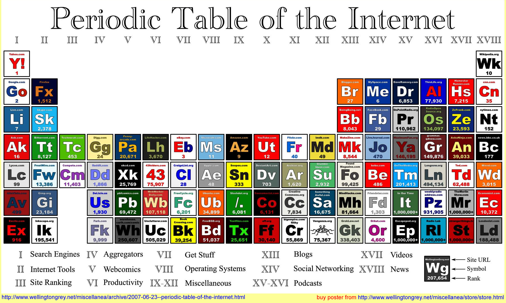
Web 2.0 Table